SIx ways to improve your website to get more students
Too much to do!
Organisations are under so much pressure these days to update their online marketing presence. The problem is that there is so much to focus on. Where to begin? Social media, paid ads, email marketing, blogging, etc. For many organisations, this can be overwhelming as they don't have the time or the resources to commit to doing it correctly. We are all aware of how important marketing has become for our work these days. However, most people neglect the most critical aspect of their marketing, and that is their website.
I have been looking at many organisations' websites over the years, and I am amazed that most of them are entirely outdated and do more damage than good. The purpose of your homepage is to set you apart from your competitors, to tell people who you are and why they should choose to work with you. It is your online digital business card.
A poorly designed homepage will get you ignored, while a good one will do its job and get you more sales.
In this article, we will go through the critical elements of what makes a great homepage, and hopefully, by the end of it, you'll be able to get some ideas and apply them to your organisation's website.
What Makes A Great Website?
Essentially, it should be simple, uncluttered, and straightforward. Your homepage should not look like a lousy catalogue crammed full of offers and the latest news. It is the first impression, and you know how important that is. If you can't showcase that your organisation is different, your potential customer will only focus on your prices, and there will always be cheaper offers out there.
There are six fundamentals that every great homepage should contain.
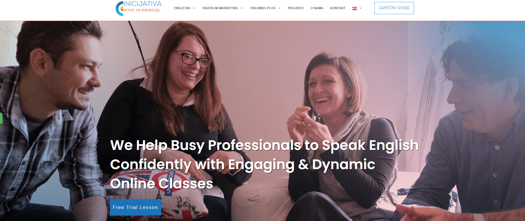
It Has A Great Compelling Headline That Talks Directly To The Customer
Your headline should be something that will set you apart from other organisations.
In short, a great headline front and centre of your homepage is an essential element you need when designing your page. This headline should not be an offer! It should tell the customer two things:
1. Who it is for?
2. What problem it solves?

If you can't describe what problem your organisation solves to your visitors in one sentence and it doesn't connect with their issues, you should rethink it. Your headline is your introduction! Don't jump into a sale before you introduce yourself!
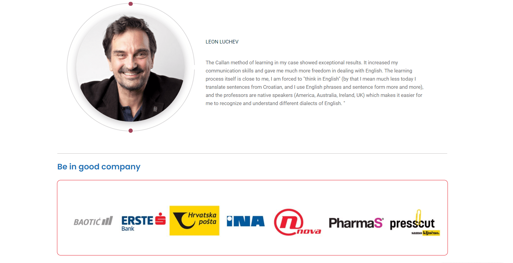
It Has Trust & Authority.
Does your site show authority?
Where possible, it's always good to include reputable companies that you have worked with in the past to confirm authority and high value in your new customer's eyes. If you have worked with companies, put their logos here.
The more you can include on your homepage, the more effective it will be to establish yourself as an authority.

Include a Selection of Your Latest Blog Posts (if you have some)
Your homepage on its own generally doesn't change, which in the eyes of Google search engines may be bad for SEO. Including some of your latest blog posts will keep your page fresh and encourage the search engine bots to keep returning to your homepage and crawling your site for new information. This will significantly improve your rankings and attract new visitors.
Testimonials and Reviews
As with trust and authority, including testimonials from your existing customers will significantly improve social proof. This will add credibility to your organisation, removing any doubts and objections from your prospective customer and encouraging them to take action.

A Simple & Effective Design
The problem: the busier the page looks, the more overwhelming it will be for your visitors and the less likely it will be for them to take the desired action. If your homepage has too many separate elements, i.e. services offered or special offers, it will look very cluttered, and the primary message you want to convey will be lost.
In short, keep things simple; use two primary colours, a simple layout with a clear, large typography set that is easily read and consumed by your visitors.
Calls-To-Action (CTA)
Are your visitors clear on the action they need to take to move forward?
Again, this may seem like common sense, but it's surprisingly overlooked in favour of design and site layout.
In short, including a clear call-to-action on your page is essential, and not only for walking your visitors down a clear path. So what is your call to action?
To call you?
To take a trial?
To download an eBook?
Decide on the best next step for your organisation.
The best CTA for most businesses is the one that gets the customer on a call, so get them to book a call and set up a scheduler like Calendly (https://calendly.com/), so they can pick a convenient time to talk with you.

Conclusion
Try to include as many of these on your homepage as you can. If you don't have all of the elements, don't worry. Try to include them over time.
The main things that you should take away from this article are that your homepage should:
- Use simple, straightforward language free of industry jargon or terminology
- State clearly who is your customer and what problem you solve.
- Set you apart from other organisations by telling visitors how you are different.
- Have clear calls to action, telling customers what they should do next.
- Build trust by showcasing your testimonials/reviews.
- Highlight your authority by showing which companies/organisations you have worked with in the past.
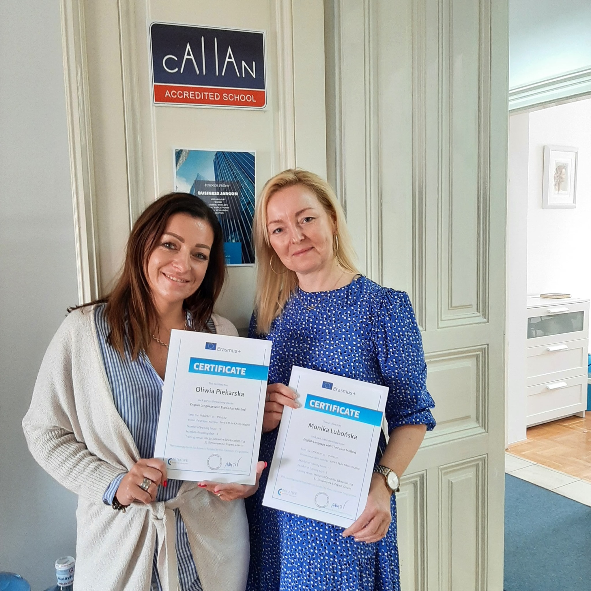
Check out our English Language courses for teachers and other Erasmus+ courses
Contact us!
Ask us whatever you are interested in.
Join us!
Let's talk.


